

SIMPLIFYING AI REPORTING
FAIRLY
CASE STUDY

About Fairly
Fairly is a startup company that is a centralized governance and audit platform providing quality assurance for automated decision-making systems.
The basic idea is that Fairly is focused on auditing and correcting Ai systems to find any sort of bias errors. These errors would be addressed to executives and developers to get these issues resolved, stay compliant with the most recent laws, and potentially increase business opportunities.
THE GOAL
Fairly is a very advanced system that was built by developers and data scientists. This made the interface very complex and focused on reporting, running tests, and other advanced features.
Although, one of Fairly’s most important features was the ability to have executives and managers check their Ai compliance status and track approval prices to get the issues fixed.
Being a startup, none of these features had been designed or realized yet and the existing UI was too complex for anyone other than developers and data scientists.
UNDERSTANDING THE USER
During the ideation stage, I had to learn about the different roles of users. This app was built more off of team experience rather than a single user. For example, there would be a data science technical team, a data science management team, then executive-level roles. The app would appear slightly different to each different user so it was important to learn about each role. It was also very important that team collaboration was a big part of this design.
ROLEs & obstacles
I was the sole designer on this project of mainly developers, researchers, and data scientists. I was responsible for creating UI solutions including creating wireframes, high-fidelity designs, and constantly iterating designs to show new features.
To sum up the most challenging obstacle during this process was to translate this highly technical information into a friendly interface for users. There were also other challenges including the fact that there was little to no existing UI, most of the team was in a different timezone, and there were occasionally some pressing deadlines.
WIREFRAMING

SKETCHING IDEAS
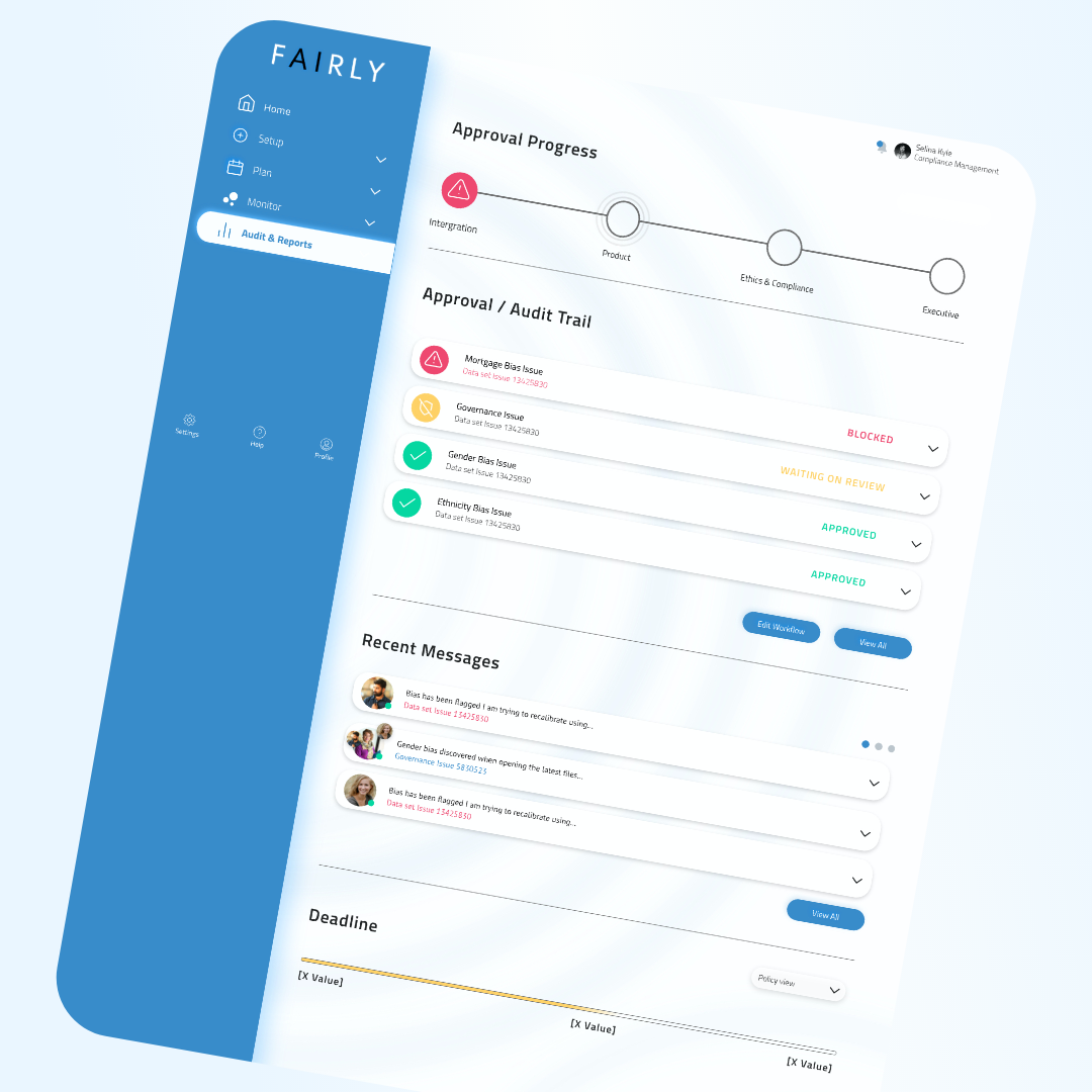
After talking to the team and reviewing secondary research, the main components became clear for the first wireframe. I began to sketch down these ideas for the first interface which was to be the ”executive dashboard”. The goals of this interface was to create a space were a data science manager or executive could quickly identify any compliance issues in a way that wasn’t over complicated.

Build WIREFRAMES
Within the first week of my project, I studied Fairly’s existing research then I needed to produce my initial thoughts on the “executive dashboard”. I created a wireframe that displayed the main compliance categories at the top of the page. I thought that from an executive’s mind, they may be overwhelmed by too much “technical data science” information. Having these main categories at the top of the UI gave the executive a quick view of their compliance status and ideas to create solutions. The wireframe was received well from the team with minor edits.

HIGH-FIDELITY
Using the main color of the Fairly logo, I incorporated this color into the navigation and the main action color.
The font used was Cairo, which has a very technical/futuristic look. With the different elements, I used many rounded buttons and white space which created a UI
that looks technical, yet still friendly.
RAPID ITERATION
At this point in the project, a meeting with an investor was coming soon and I now needed to produce a more high-fidelity design to be included in a presentation. This process would repeat several times causing rapid iteration on these designs with the team.


REFLECTING
After my 40 hours were completed with Fairly, I had successfully created 4 different user flows within high-fidelity prototypes. These new UI prototypes were valuable during Fairly’s presentations and helped investors visualize how their goals would be met.
