

VIBE |
case study
VIBE is a music streaming app that had started with a free subscription plan. The brand had already built a good foundation of a user base, but now the brand was looking to create a paid subscription plan while making sure that the new plan struck the balance of feeling necessary but not forceful.

The Goal
VIBE is a music streaming app that had started with a free subscription plan. The brand had already built a good foundation of a user base, but now the brand was looking to create a paid subscription plan while making sure that the new plan struck the balance of feeling necessary but not forceful.
My role
I was responsible for gathering research to create the details of this paid plan and find creative ways to add CTA’s throughout the user flow and with the design.

COLLECTING RESEARCH
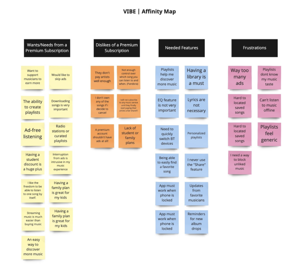
AFFINITY MAPPING
The music streaming market is extremely saturated, so I decided to start my research from other competitors and market research. I also sent out a survey that asked important questions like “what is the most and least important premium feature when upgrading on a music service”. The secondary research along with this survey helped narrow the most important features of this app.
Interesting findings:
Users are willing to pay for a music service
The way users listen to music has changed (playlists, recommendations, etc are most popular)
Users enjoyed personalized recommendations for their music.
Removing ads was probably the most important premium feature.
Downloading songs and creating playlists was also very important

USER FLOW
From my research and competitor analysis, I knew that users are very familiar with using a music app. One of the most important flows needed to be a really fast and easy account creation process. This app needed to be incredibly easy to use and be very aware of avoiding cognitive load.
Introducing the CTAs within the app was also very important to getting a user to upgrade their account. These CTA pages were strategically placed once within the onboarding process and multiple times when a user accesses a premium feature.

WIREFRAMING
My first concept was designed as a wireframe inside Figma. The design continued to have a focus on an intuitive flow and a focus on upgrading to a premium account. The upgrade CTAs were designed to not be intrusive or annoying but still seen as necessary. Several usability tests were held to gather more further research on these design concepts.

BRANDING
The branding of VIBE was designed for tech-savvy users who frequently listen to music. For this design, I aimed for a modern and sleek look while still remaining vibrant and fun. The colors were kept very simple and the dimension was used frequently with UI elements. I felt that these users would be able to appreciate the simplicity of this design.

DESIGNING VIBE
The final design of VIBE implemented all of my research along with the branding to create a unique music app. Each screen was designed to be extremely simplistic and easy to use and understand. The CTA to upgrade to a premium account feels necessary but not invasive or annoying. For music lovers, the player creates an immersive style for each album with the reflection of each album cover as well as throughout the app.
More usability testing was conducted to perfect the design and confirm the flow of each user. The users offered only minor feedback and really enjoyed the style of the app.
All of my research and testing created an intuitive, noninvasive, and creative way for users to upgrade their accounts on VIBE!