

Journey
case study
For a few seconds, imagine you plan a trip to a different country to enjoy your passion for travel. You have several destinations in mind for your trip and realize you need a car to get to all of these places. So the next obvious decision is to rent a car. You decide to book a rental car on a travel website and when you arrive, your trip gets off to a bad start. You are bombarded with confusing restrictions, the pressure to buy insurance, and a ton of frustration, not to mention a potential language barrier depending on the destination. This is the last type of experience you want after you are jet-lagged and eager to enjoy your trip.

Renting a car is still a very essential part of the travel industry, although the experience is in desperate need of a refresh.

creating a new experience
Goals
Create a stress-free booking experience.
Reduce confusion by giving users easy access to any information they need.
Lower time of booking process to let users get on with their trip.
Provide additional assistance and tips on their trip acting as a travel companion.
my role
As a UX designer, my role was to learn more about the users by conducting research, creating the brand image, and implementing designs. I needed to start by gathering more research on the users, learn more about the common issues, then use a user-centered design thinking process to create solutions to these problems.

UNDERSTANING TRAVELERS
My first step into refreshing this experience was to take a closer look into the mindset of travelers. I started my research by conducting interviews. I asked travelers about and what they wanted and needed when renting a car.
After these interviews, I began to implement other research techniques to find commonalities such as:
Empathy maps
Journey maps
Personas
User stories
Guerilla usability testing


SYNTHESIZING MY RESEARCH
Now with my research completed, The focus was now narrowed down and it became very clear what users wanted.
An easier way to understand insurance
A way to compare pricing
A way to create a car preference
Make the experience faster
IDEATION

CREATING STRUCTURE
I started to construct a sitemap to aid in visualizing the main navigation and components for this app. This added a structure to each page that was created while narrowing the focus for each goal. Once this was created, I connected every page by creating a user flow
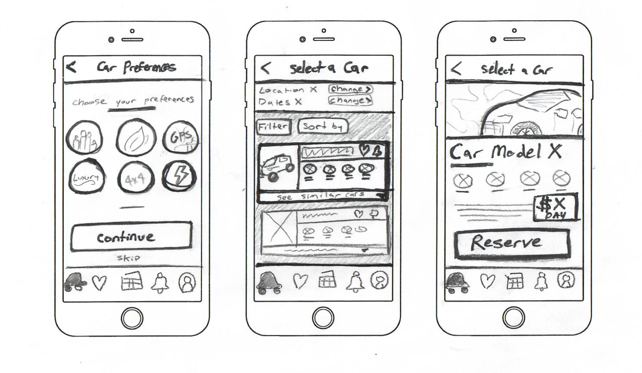
SKETCHING SOLUTIONS
I started to construct some sketches to fix the problems that were discovered. My original designs had the goal to keep the process really intuitive for a user. I did not want to reinvent the wheel at all, just refresh the experience and make every step very easy for a user to understand.

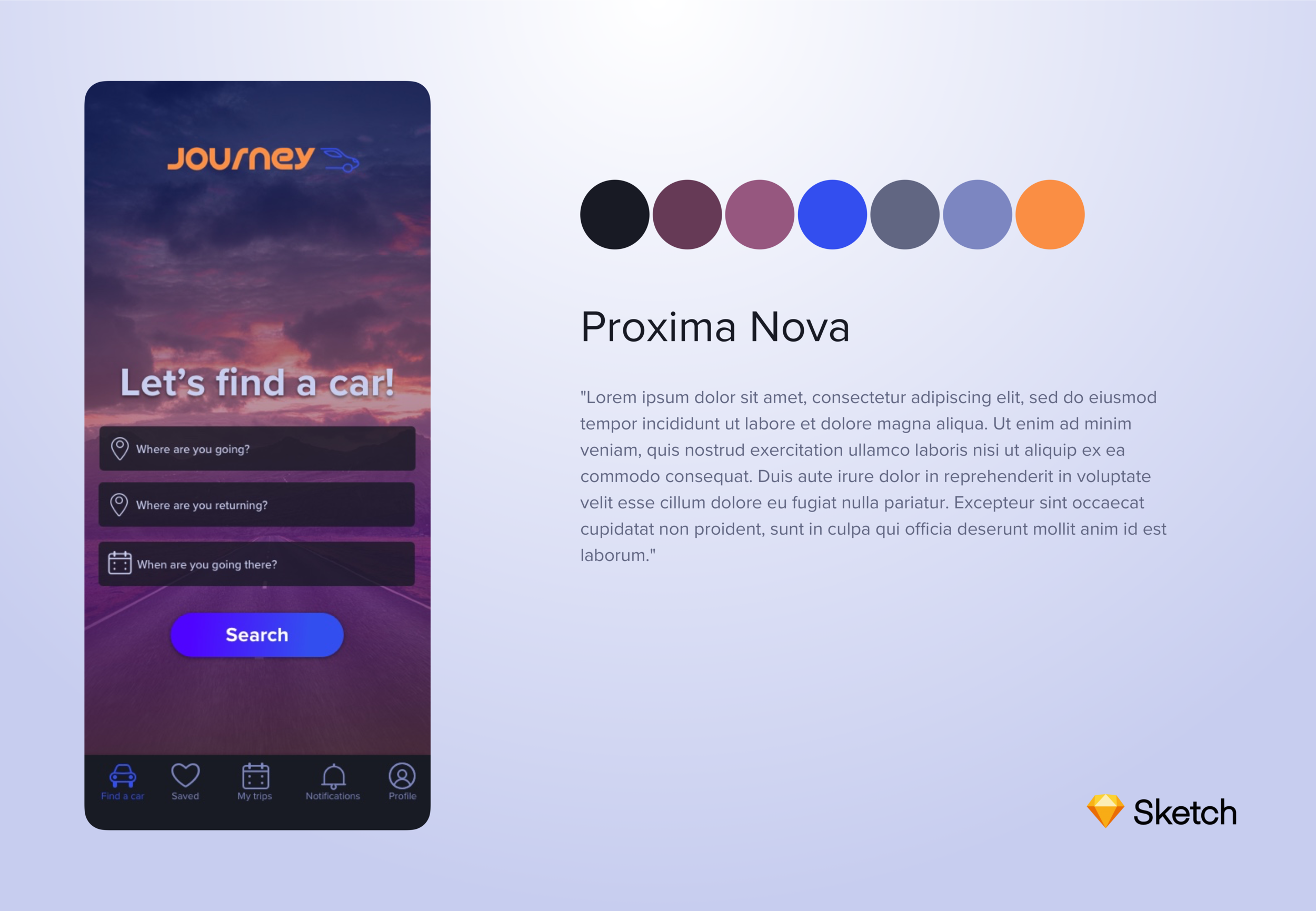
designing the brand
When thinking of the branding of Journey, I knew that there needed to be a focus on the passion for travel. This is a common interest that unites all users. The idea behind the brand name “Journey” is to inspire someone on their trip beyond just renting a car. This car will take them to new places, let them experience new cultures, and create lasting memories. “Journey” is more than renting a car, it encompasses that adventure that you will be embarking on.
IMAGERY
With the main focus on travel, Journey frequently shows vibrant epic pictures of your destination. Specifically, focused on nature and historical landmarks. I decided to exclude any images with people to allow someone to paint a picture of how their trip will be for themselves.
COLOR
Directly inspired by a sunset, this is very symbolic of the ending of a great day and to inspire hope for more good days to come. People feel a connection to sunsets because of this underlying message. The colors feel somewhere between hot and cold, day and night, while still remaining calm, yet vibrant.

WIREFRAMING
I created low-fidelity wireframes to test out my ideas on these solutions. They were meant to test out the most basic functionality of each page and component of the design.
USER TESTING
After the wireframes were finished, I started usability tests with the targeted user group. I gave them several tasks to complete within this prototype to test out the functionality. All the users thought that the design was very intuitive and easy to understand. There was also feedback offered from some users such as buttons needing more of a visual que to its function.

CREATING A UNIQUE SOLUTION
The final design came together with all of the user feedback incorporated with the style and vision of the brand to create something unique. The result was an answer to all of the user’s problems in a very intuitive and refreshed interface.
Renting a car was no longer a stressful or confusing process. Journey solves the problems holding you back from starting your travel off right.
Reduced booking time:
Important car information available at a quick glance.
Any unnecessary steps are optional.
Filter and Edit options are built-in reducing load times and having the user start the process over.
Comparing Prices:
Optional pricing notifications available.
Pricing chart that shows users when the best time to buy is.
Full trip total always displayed along with the daily prices for reduced confusion.
Reducing confusion:
Important insurance FAQ’s built-in to the booking process.
Important trip notifications to guide a user through the pick-up and drop-off.
Custom itinerary for users to understand exactly what step is next.

