
5 DAY SPRINT

case study
gallerypal
DAY 1
Day 1 involved learning about the project from business goals, inspiration, obstacles, and more.

The Problem
Gallerypal is looking to improve the experience of guests while they are at the museum. From user feedback and research, many guests know little about each piece of art before arriving. This information is vital to transforming the experience of each piece into something more memorable. Guests without a guide may not learn enough about each item to understand the significance, therefore leaving them with a potentially bad experience. Many guests who are interested in learning more about this information at the museum will search on the internet but are quickly overwhelmed with an abundance of information. This also goes for guests who search other sources of information such as books, but commonly discover that this can be too lengthy and detailed.
GOALS & CONTRAINTS
Brand Goals:
Increase customer satisfaction when viewing art in the museum.
Provide background information on artists, additional info, fun facts, etc.
Improve the overall experience for guests.
Constraints:
Needs to be focused on an in-person experience (at the museum).
Designed for mobile for overall usability and mobility.

DAY 2
Day 2 begins the ideation and discovery phase to learn what features needed to be included and why?
IDEATION

COMPETITOR ANALYSIS
On Day 2, I did some research to find some popular museum and art focused apps For the lightning demos I mainly used Google’s Arts & Culture, MET, Louvre Museum, and Smartify .
One of the main features of Smartify and Google’s Arts & Culture was the ability to scan a picture, statue, or display that a guest was near. I feel that should also be the main feature for Gallerypal to give a guest the option to learn what they want when they want.
As far as reading the content, I once again really enjoyed the Spotify and Google’s Arts & Culture. Smartify has a layout similar to Apple Music with featured artists, easy to read cards, and facts. I also appreciated how Google’s Arts & Culture gave a full-screen image with easy to read text that really feels immersive.
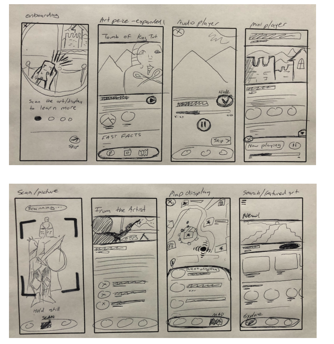
CRAZY 8’S
When thinking of solutions for Gallerypal, I knew that guests wanted to easily find what they were looking at so I imagined a scanner would work great. Onboarding the guest also seemed like a great idea to quickly introduce them to how the app works. This feature would open the camera of the user’s phone and locate the associated page.

DAY 3
After spending some time looking through my sketches, I decided to go with the app over the responsive website. I feel that this will offer a guest a more immersive experience. The app has a benefit of the ability to scan a picture instead of using your camera app to scan a QR code each time, which could become a usability hassle.

STORYBOARDING
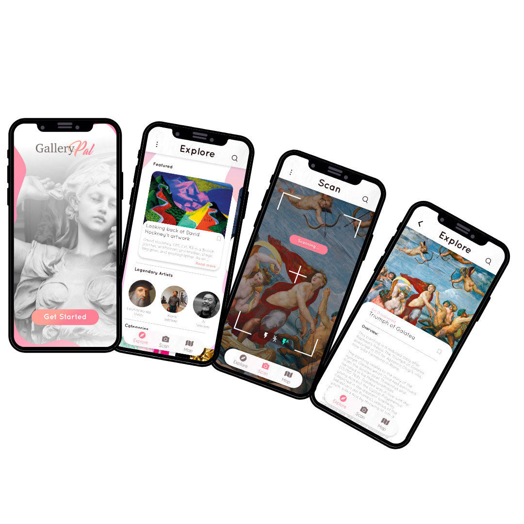
Now that the solution was decided on, I began to storyboard these sketches. I wanted the app to be extremely easy to use for guests. I started the storyboard with a splash screen. Once a user passes that they will be dropped into the main interface, this will show them links to the main functions of the app; Explore, Scan, and Map.
The main storyboard shown is the process of scanning a picture to learn more about this artwork.

DAY 4
Day 4 was dedicated to rapidly creating a high-fidelity wireframe from my previous research.

BRINGING MY
SKETCHES TO LIFE
For prototyping, I chose to use Adobe XD. I chose 3 main features to be front and center as the bottom navigation; Explore, Scan, and Map. Explore was designed as a news feed approach to current artwork around the world. The scan feature is centered in the navigation and gives the user the ability to search any artwork by using their camera. Then finally the map feature, which lets users search for nearby artwork.
For the design, I chose really soft colors that almost looked painted, with mostly whites, pinks, and hints of white granite. This was designed to appeal to fans of modern art as well as vintage artwork like sculptures.

DAY 5
Day 5 was dedicated to testing the prototype to work out any issues and improve the overall UX.
Finishing up

Testing
For usability testing, I recruited 5 people who had a passion or interest in art. I chose 5 tasks for the users to complete, mostly around the ability to scan an image for results and search for artists and articles. Every user thought the design was very easy to understand and navigate. The users successfully completed each task in usually taking the exact same path. Some patterns were during these tests, for example, some users would frequently return to the search icon to find something instead of the navigation.
reflecting
For the sprint, all of the main problems were answered within the design. For users looking to learn more about artwork when at a museum or art gallery, they now have the ability to scan artwork and learn about it. This app was also designed to be used for any category of art around the world, with options like bookmarking and search, Gallerypal can be your art companion.